
Comprehensive Development of a Scalable and Stylish E-Commerce Software Solution to Elevate the Online Shopping Experience for a Fashion Brand
The client’s existing app no longer aligned with the company’s updated brand concept—it was outdated and slow. Most users were dissatisfied with their experience and frequently requested improvements to simplify the clothing ordering process. Prior to the update, users encountered several challenges when trying to browse or complete their purchases, including:
The company’s e-commerce department managed both the mobile app and website, focusing on enhancing the user experience. They continuously monitored user feedback to refine their digital strategy and optimize engagement.
To address these issues, the company envisioned a completely revamped app. This required a full redesign of the interface and the integration of new, user-friendly features. Their primary goals included:
To bring this vision to life, the e-commerce department sought a skilled team of developers, testers, and analysts to tackle these challenges and deliver a seamless shopping experience.
The company discovered our services through former clients within the same holding company. Their in-house team had already developed the backend and design for the mobile app, and our role was to build the frontend using modern technologies while enhancing the UX/UI based on their design concept. We analyzed customer feedback to implement intuitive in-app mechanics for selecting clothes and placing orders, streamlined the purchasing journey by reducing unnecessary steps, and worked under tight deadlines—completing development within five months to launch before Black Friday. The client approached us with well-defined tasks, aiming to avoid the shortcomings of their previous app. To meet their needs, we assembled a team of experts who not only executed the required tasks but also provided valuable insights for further improvements. For instance, we suggested a strategy to lower app maintenance costs while increasing revenue—details of which are covered later in this case study.
The company aimed for simplicity and minimalism in its branding, incorporating muted, natural tones into its collections and physical stores. To align with this aesthetic shift, the new app needed to reflect the same clean and modern design.
We conducted a thorough analysis of the app’s performance while keeping the new design in mind, examined customer feedback, and identified issues in the ordering process to refine the app’s logic. Our research revealed that one of the major trends in the fashion industry in 2022 was a strong emphasis on content and visuals in mobile apps. Photographers and stylists intentionally curated product images to enhance their aesthetic appeal in the app, allowing customers to better visualize garment fit and style.
Based on these insights, we provided recommendations on optimizing the app’s interface, including strategic placement of elements and feature implementations to enhance simplicity, minimalism, and efficiency. In the updated version:
The client approached us with a complete UI kit for the app redesign. It had been three years since the initial app launch, and customers had grown frustrated with frequent reloads and the tedious process of searching for items—they wanted a faster, more convenient shopping experience. Beyond the redesign, we were tasked with implementing new features to drive mobile app sales.
To execute this, we assembled a team of developers and testers to build and refine the app for both iOS and Android. Given the company’s goal of launching before Black Friday—an essential event in e-commerce—we had just five months to complete the project.
Our team created app screen prototypes, explored multiple user journey variations, and proposed enhancements to elevate the experience, such as integrating videos within product cards and catalogs.
Within five months, we successfully developed an MVP featuring core functionalities, which the client’s team reviewed, approved, and validated for launch.
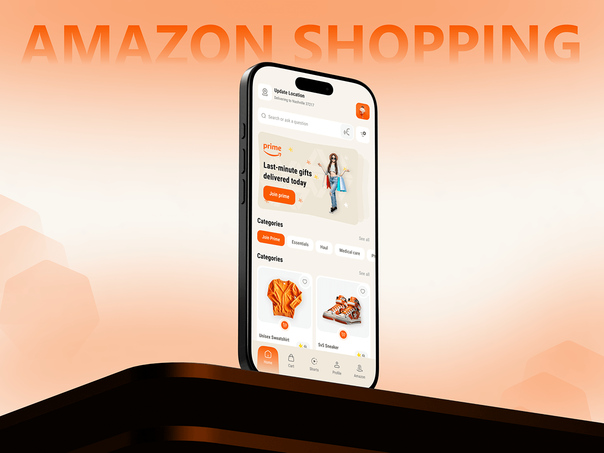
The home screen of the app serves as the face of the fashion brand, where every detail matters—from the draping and colors of the clothing to the shot framing and typography. Working with the client’s UI kit, our primary goal was to ensure the home page effectively reflected the brand’s identity and positioning.
The client’s team wanted content managers and marketers to have the flexibility to quickly update app blocks to align with evolving business goals. To achieve this, we enabled seamless editing and rearrangement of photos, videos, and other visual elements directly from the backend. This allows the client to refresh the home page’s look and feel without needing to re-upload the app to the stores.
Additionally, we incorporated video elements to align with emerging retail trends. Video content has become a powerful tool for boosting conversions, especially within product pages. The client can now add clickable video banners that lead to curated collections, enhancing the shopping experience and driving engagement.
We designed the shopping flow to accommodate different user preferences—some prefer to browse the catalog before signing in, while others register first. By considering all possible user behaviors, we crafted a seamless experience that keeps users focused on shopping and guides them effortlessly to checkout.
This streamlined process ensures a frictionless shopping experience, increasing conversions while maintaining user convenience.
Improved catalog display to help users avoid confusion and make purchases faster
Users can customize their catalog view to suit their preferences. For example, some people prefer a tiled view of the catalog items, while others like to see each image in detail. To change the preview, a user simply moves the slider and selects the view they prefer. App’s catalog
A catalog is an important part of any modern e-commerce application. Since the client’s brand sells numerous items, we worked to make catalog navigation as easy as possible for users.
Smart Search helps find products even before they finish typing. For example, when the user starts typing “skirt”, the app helps specify the query by suggesting “midi skirt” and “leather skirt.” The catalog filter does not take up much screen space but includes all the necessary parameters: color, size, store selection, and sorting types. Users can also sort items according to personal recommendation based on data from the Mindbox platform.
Enhanced item cards to decrease returns
To make the item cards as informative as possible, we used a custom double slider. The card shows if an item is available in multiple colors, and it only takes a single touch to change it to another color.
Below you can see the items that match the selected item as closely as possible: they can be used to complete the look.
The more the user knows about the item, the less the store has to deal with returns due to poor fit or wrong size. We ensured that the product cards contain detailed information about the items. We placed all the necessary information below the items using popup elements: size table, description, store availability, delivery, and return policy.
Added a Wish List to keep customers coming back
The old version of the app didn’t let users add items to the wish list, so users had to keep searching for their favorites over and over again. We added a Wish List section where users can add items they like and see their current prices. The app loads all item details from the backend. The section makes users’ favorite items available for purchase at any time.
Implemented a loyalty program to increase customers’ trust and the number of orders
The company has had a loyalty program almost since it opened its first offline stores. A customer receives a loyalty card after their first purchase. With the launch of the app, it was necessary to bring the loyalty program to this digital channel in order not to lose any customers. We enabled users of the app to issue a virtual loyalty card. This helped the brand retain existing customers and attract new ones. To apply for the loyalty card, the user fills out a simple online questionnaire. All data is stored in the user’s profile. To use the bonus points in an offline store, the user must show the code generated in the app to a store assistant.
Reduced time to market and development costs with Flutter
It was important for the client to meet tight deadlines without compromising the performance and functionality of the app. We suggested developing the app using Flutter, a cross-platform framework created by Google. The technology allows to:
Reduce the development costs by up to 40%. This is possible thanks to the use of a single code base for both iOS and Android apps. Decrease time to market. Cross-platform development allows a company to get its apps into digital stores twice as fast as native. Customers can start using the product, and the company can start generating revenue from this channel sooner.
In addition to the e-commerce software solution development, we needed to set up deep linking: a user sees an ad, follows the link, and immediately opens the card of that specific product in the app. This simplifies app navigation and increases conversion to purchase. We ensured the security of these links to connect the app to the brand’s official website.
We used AutoRoute, a Flutter navigation package that makes it easy to create deep links and uses code generation to simplify route customization. This allowed us to develop the app’s navigation faster.
Initially, the client planned to create the MVP of the app and then start the development of a fully functional product. Thanks to modern technology solutions and our understanding of the client’s business needs, we were able to use Flutter to create a fully functional product and launch it in the stores.
Results
This was one of the most exciting experiences we’ve had developing B2C and B2B e-commerce software solutions. In 5 months, we’ve created a new shopping app for a major fashion retailer and released it in time for Black Friday. As a result, we saw an immediate increase in online orders, receiving approximately 300 orders in the first 3 hours of the sale.
The company was pleased with the results, and we offered to continue working on the app’s future updates. Currently, we are monitoring the analytics of the app’s usage and users’ wishes, which we get from feedback forms and the brand’s social media. We aim to incorporate all constructive suggestions into the project development backlog and anticipate having a long-term and fruitful relationship with the client in the future.